Friday, 30 October 2009

Include Logo in Animations

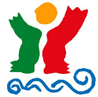
I am now including the Turismo de Portugal logo's character (see bottom picture) in the animations of my idents. For example in my Portuguese tram idea I will use the logo as the main character in my animation. Some of the reasons for using this character are:

The logo will be recognised more
The character will stand out more in the animation (as the others will be humans)
It will create a link as he will be used in them all
It will draw attention to Portugal more with the logo character and the flag and website colours
included.

Thursday, 29 October 2009

Formative

Opinions passed across to me in my formative by Steve and the group also being assessed 
  • change character 
Steve and the rest of the group thought that I should change the character of my tram ident idea to the Turismo de Portugal logo character. I do agree with this. A suggestion was also made though to do the same in all of the idents that I use. I am not sure about this because, after hearing people's verdicts on which ident ideas were the best, I am going to use the crab idea (which wouldn't work using the logo)
  • In fisherman ident, do not include dark weather at start
I was not sure that I wanted to take this out at first because the dark weather start, changing to sunny when Portugal picture appears, seemed a good idea to me. On reflection I decided that the dark sky could show Portugal in a bad light (tee he he :) ) So I took it out
  • do not use dancer idea in my final three idents as it would take too long 
I thought that this was good advice and it wasn't my favourite ident anyway!

I found the formative advice really helpful (what a creep I am lol)

Final three chosen ident ideas

Tram
Fisherman
Crab

Tuesday, 20 October 2009

Photos of Portugal and Its Culture

Below I have tried to choose a photograph of Portugal to illustrate each attraction that Portugal offers.
Most of these photographs that I have loaded are ones that I have taken on my holidays in Portugal over the years (I go on holiday there with my family at least once a year).
A couple are from the Internet though, as I felt that there were important attractions left out eg dancing and Porto.


Portuguese Ramparts in Obidos
(not far from Lisbon)


Beach in Sesimbra
(not far from Lisbon)


Beach in the Algarve


Beach and Beach Bar in the Algarve


Portuguese Ramparts near Penna Palace.


Traditional Portuguese Street


Porto


A Tram in Lisbon (Capital of Portugal)


Lisbon


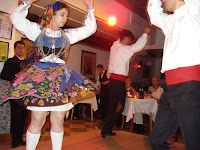
Portuguese Folk Dancing


Chosen Idents

Chosen Idents


The three idents that I have chosen to use are:
The Portuguese Tram Ident


Portuguese Fisherman Ident


Crab on a Beach Ident

Storyboards and Notes

Storyboards and Ideas

Here I have included my spider diagrams and the storyboards that I made. I did storyboards for my five best ideas and then I chose my three favourite of those to use for the assignment as I am doing three ten-second idents. I wanted my idents to be ten seconds so I could tell a short story as well as showing Portugal. I will animate them all in 2D on Flash. I would also like to include photos in all the animations because I feel that as it is an ident for a company that is attracting tourists to go to Portugal, the country has to be shown.


In this page I have included spider diagrams of ideas that I have had that I would think about using for my Portugal ident.
The other diagram that I have included on the page is for traditional and historic items and places as I believe that will be helpful when designing my idents.


In this ident I have chosen for a man to be in a tram in Lisbon and I am using a video of the famous route No.28 in the background behind the window. The tram will be going over bumps (the characters and items in the tram will be moving around) When the tram stops the character will walk out to the exit and then the famous landmark "Torre de Belem" will be in the background and the character will take a breath of fresh air as he is pleased to see a beautiful site in Portugal. As he makes the breath he will lift his arms up and then morph into the logo for Turismo de Portugal as the logo is in the same position.

In this ident's animation there is a Portuguese fisherman who is asleep in his boat holding his fishing rod. Then there is some pulling on the end of the rod which wakes the fisherman up .
He then starts reeling the line and pulls it back to discover that a picture of Portugal is on the end (the picture inside the frame keeps changing). The picture then heads towards you. A character shown in the photo then morphs into the logo.


This ident is set on a beach and a crab wa,nders across from off the screen on the left. He then waves and turns around and digs a framed picture (that changes) with each claw and he throws them backwards towards the viewer. The last picture that is shown, I want to morph into the Turismo de Portugal's logo character.


In this ident there is a golfer, as the Algarve in Portugal is well known as a golfing holiday destination. He is bending down ready to take his shot and then he hits the ball across and the viewers are shown the golf ball heading towards the hole. The ball then unexpectedly hits into a sheet of glass (which shows the golf course through it) and the glass shatters to show lots of pictures of Portugal behind it. NB It is not obvious that it is glass until it breaks. The pictures then all turn around in a circle to show the Turismo de Portugal logo.

This ident shows Portuguese folk dancers, dancing in lots of their traditional ways (written on side of storyboard). Photos of the area of Portugal that the traditional dance is from will show in the background of the animation. A dance would be used from each of the most popular places in Portugal e.g. Porto, Lisbon and the Algarve. (as shown on the storyboard). Then at the end, a male dancer would be shown with his arms up in the often-used position for Portuguese dances and then that would morph into the Turismo de Portugal logo as that charcter's arms are shown in the same place.

Examples of the Computer brochures Visitportugal Sent Me

Here are some examples that I have chosen from the brochure that Visitlisboa sent me by email.


and these are some examples from the brochure that Visitportugal sent me.


Sent Emails and Replies

Emails

Below are the emails that I wrote to some companies. I wrote to Turismo de Portugal because wanted to find out what they would really want to show in their idents. I also asked them questions like " I wondered if you would also be able to tell me what the VisitPortugal logo represents." I was interested in this as I wanted to know if it was a human that it represented or I also wondered if it was the country shape with the sun above it, to show how the country always has the sun.
I also emailed British Gas to find out how their recent adverts have been made.

Email About Turismo de Portugal's Logo


Dear Stephen Pender,


It was created in 1992 by a well-known Portuguese artist, José de Guimarães.


The symbol has made having our flag as main reference, as you can see by the colours, the sun and the sea are also represented and all together represents a person welcoming those that want to visit our country.


tdp

Here you can download a smaal film with the author, showing how was built the idea (unfortunately in Portuguese)


http://www.sendspace.com/file/wxm2rd


Evolution:


Best regards,


Bruno Charrua

http://www.blogger.com/www.visitlisboa.com


Bruno Charrua,


Thank you for your reply and the attachment, it has been very helpful. I wondered if you would also be able to tell me what the VisitPortugal logo represents.

Thank you again for all your help

Stephen Pender


Emails


s.pender@rave.ac.uk - contact@britishgas.co.uk

Hello,

I am a student on an animation course at Ravensbourne and I am very interested in how your resent animated adverts are made. I would be very grateful if it is possible for you to e-mail me which agency created it.
Thank you

Stephen Pender

christopher.brocklehurst@centrica.co.uk (British Gas) – s.pender@rave.ac.uk

Hi Stephen

Thank you for your email regarding our Planet Home animation.
The idea was developed by our Advertising Agency CHI & Partners who are based in London – the actual animation is produced and created by a company called Hornet who are based in New York (/www.hornetinc.com) – Gui Marcondes is the Director, who has creative the animation style.
We have used various techniques so far - a mixture of 4D animation packages, filming real models, claymation and stock-frame animation.
I hope that helps.
Many thanks
Chris

s.pender@rave.ac.uk - info@chiandpartners.com

Hello,

I am a second year student at Ravensbourne College of Design and Communication studying animation. I am currently working on a project to animate a range of idents and I really like the style and mood of your British Gas television advertisement (featuring Rebecca Adlington).
I am sorry to bother you but it would be very helpful if you could give me some details about how the animation was made especially how the real human faces were constructed and integrated with the movement of the animated bodies.
For my project I would like to use this style of animation, so any help you could give me would be really appreciated.
Thank you for your help
Stephen Pender

No Reply


s.pender@rave.ac.uk - miguel.perestrello@turismodeportugal.pt

Hello,

I am a second year student at a university in London studying animation. I am currently working on a project to animate a range of idents and I have chosen to base mine on your website as I have enjoyed going on holiday to Portugal since I was very young.
I am sorry to bother you but it would be very helpful if you could send me any information regarding the design brief for your website - in particular it would be helpful to know about the choice of themes, visuals, colours etc.
Please let me know if you require further information.
Thank you for your help

Stephen Pender

info@visitportugal.com (miguel.perestrello@turismodeportugal.pt) – s.pender@rave.ac.uk

Dear Mr STEPHEN PENDER

We thank you for your e-mail, which contents have been duly noted.
In what refers to your enquiry we are pleased to inform you that according to your request (accademic studies ) we are sending you here, the Brandbook used as a base for the website's design.
Do not miss the Allgarve program, from April to October, and get ready for new lifetime experiences in contemporary art exhibitions, musical concerts, international sporting competitions and gourmet desgustations in the gastronomy festivals. For further information please consult www.allgarve.pt
Should you require any further information, please do not hesitate to contact us,
from Monday to Friday from 8h to 19h (GMT).

Kind regards

Turismo de Portugal
www.visitportugal.com

s.pender@rave.ac.uk - atl@visitlisboa.com

Hello,

I am a second year student at a university in London studying animation. I am currently working on a project to animate a range of idents and I have chosen to base mine on your website as I have enjoyed going on holiday to Portugal since I was very young.
I am sorry to bother you but it would be very helpful if you could send me any information regarding the design brief for your website - in particular it would be helpful to know about the choice of themes, visuals, colours etc.
Please let me know if you require further information.
Thank you for your help

Stephen Pender

bcharrua@visitlisboa.com - s.pender@rave.ac.uk

Dear Stephen Pender,
Thank you for choosing our website.
Unfortunately we really don't have anything written related with the
website, it was based on several meetings and with "on job" interaction.
We just followed some main items of our graphic orientations that you will
find attached ( I hope you can read a bit of Portuguese).

Best regards,

Bruno Charrua

s.pender@rave.ac.uk - turismodoalgarve@turismodoalgarve.pt

Hello,

I am a second year student at a university in London studying animation. I am currently working on a project to animate a range of idents and I have chosen to base mine on your website as I have enjoyed going on holiday to Portugal since I was very young.
I am sorry to bother you but it would be very helpful if you could send me any information regarding the design brief for your website - in particular it would be helpful to know about the choice of themes, visuals, colours etc.
Please let me know if you require further information.
Thank you for your help

Stephen Pender

luisa.correia@turismodoalgarve.pt - s.pender@rave.ac.uk

Dear Stephen,

In reply to your information request we have the pleasure to inform you that the Algarve Tourism Board website: http://www.visitalgarve.pt/?idioma=en
is supposed to give information on the destination: natural, cultural and heritage resources as well as all tourism services (accommodation, restaurants, rent-a-car, etc).
The website was designed based in the concept of our slogan "Feel the energy" and was intended to be as user friendly as possible, and also to allow interactivity through items like the online chat.
As far as it concerns the colours and layout, we tried to follow those we already use in our printed materials in order to maintain a coherent image. Those printed brochures are the ones that are also available in digital format in our website.
We do have a written memo about the evolution of our logo but it is only available in Portuguese and can be accessed in our institutional website: http://www.turismodoalgarve.pt/Sites_Entidades/RTA/vPT/A+Instituição/Sistema+de+Identidade/
We hope we have answered all your doubts, but please free to contact us again if any further doubts do arise.
Sincerely yours, we remain,

Luisa Correia

Sunday, 11 October 2009

Indent Research

Idents That Have Influenced My Work


Here is my favourite ident that I have found. It is for an animation, motion graphics and VFX company called Once Were Farmers. Below is a link to their website.
http://www.oncewerefarmers.com/index.html


I have always liked the style of the British Gas advert below.


I also like the style of the Angela Anaconda animation


Here is a link to a video about how it was made:
How Angela Anaconda was made

Other Liked Idents


I am very interested in the next two idents (below) for the Kerrang music channel because of the animation style and I am also going to make one of my animations about a Portuguese fisherman in a quiet background.


I really like all of the MTV idents below and the way that, when they are played, the letters form themselves from things that are lying about in the background of the scene.


In this famous channel 4 ident below I like the way that two idents makes the "4" light up by Homer drinking from a can of beer balanced on the electricity cable.
Another thing that impresses me about it, is the way that the camera moves from Homer to the sky, looking down onto the houses, where the number 4 lights up as he drinks.